Filibuster 2.0: Computing API coverage of a Microservice Application
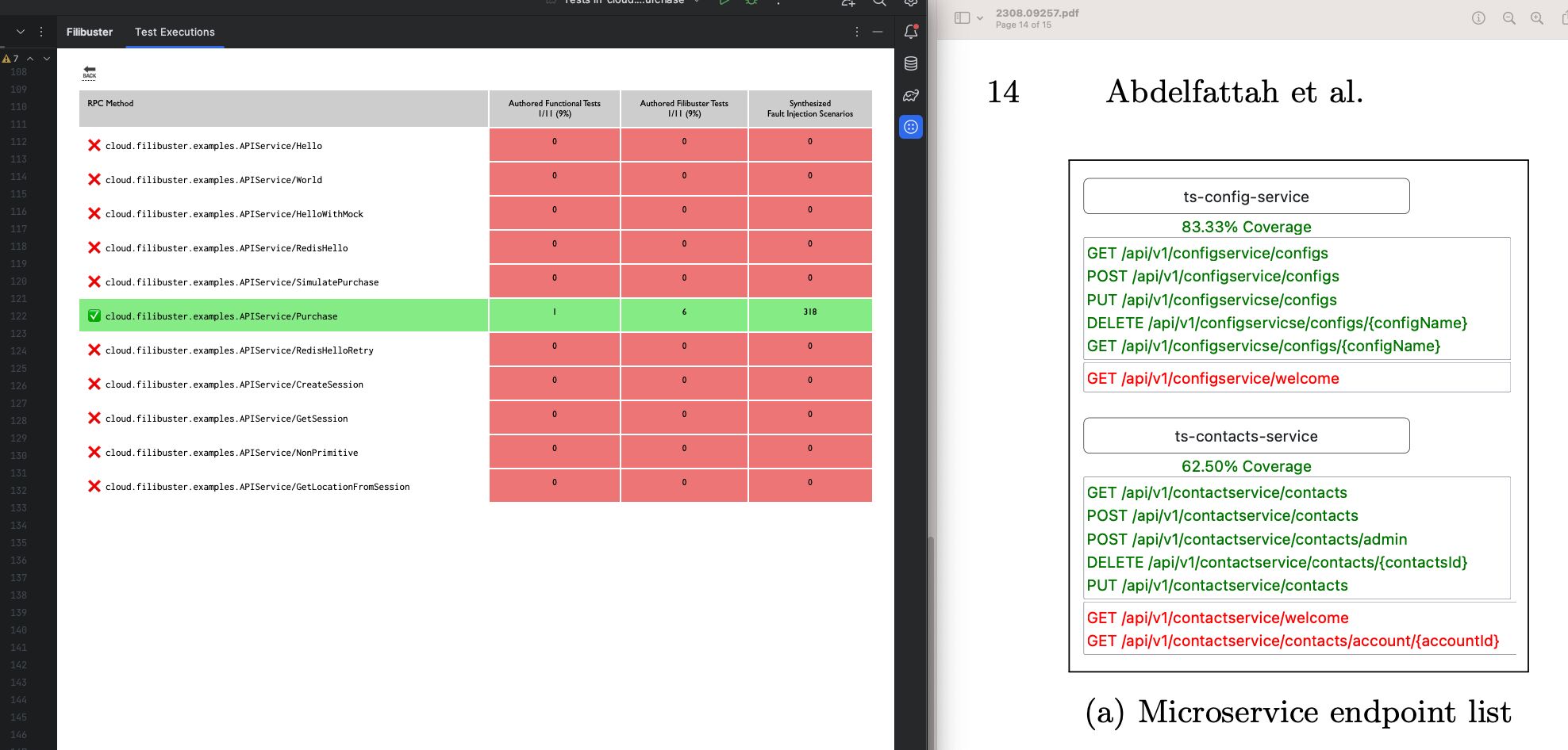
About two months ago I started prototyping this feature for visualizing API coverage in a microservice application through automated instrumentation: see where you have functional testing coverage, how many functional tests, and where you’re applying fault injection to determine the impact of those changes.
Flash forward to yesterday, a new paper draft on arXiv proposed (almost) this very thing – they went a bit further in their study and provided more comprehensive visualizations and an accompanying study. In contrast, mine is running on real code written by industrial developers. On the left, Filibuster; on the right, their proposal.
Good ideas happen at the same time, I suppose!
(e.g., Mattern and Fidge both independently coming up with the idea for vector clocks the very same year.)
